









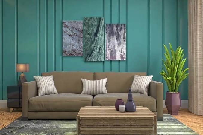
Choosing the right color is an integral part of any luxury interior painting project. Color influences how a space looks, feels, and interacts with lighting and surrounding design elements. Selecting a shade before painting helps create a cohesive finish that complements the room’s overall style. Here are a few tips on selecting the right colors for luxury interior paint:
Mapping Your Room’s Natural Light
Natural light affects how luxury interior paint colors appear throughout the day. Changes in sunlight can alter a color’s brightness, warmth, and overall appearance, making it helpful to view paint samples under different lighting conditions. Testing colors at multiple times of day provides a more accurate representation of the finished result.
Room orientation also influences how colors are perceived. North-facing rooms receive cooler, indirect light, while south-facing rooms typically receive warmer, brighter light for much of the day. Evaluating these lighting conditions helps guide color selection and supports a finish that complements the space.
Reading the Room’s Existing Elements
Existing design elements influence how paint colors appear within a space. Flooring, cabinetry, countertops, trim, and textiles each contribute undertones that interact with wall colors. Evaluating these features before selecting a paint color helps create a balanced palette that complements the room’s permanent finishes and furnishings.
Matching Sheen to the Surface
Paint sheen affects both the appearance and performance of a finished surface. Different sheen levels reflect light differently and can change how color appears within a room. Selecting the appropriate finish depends on the room, surface, and desired look.
Higher-sheen finishes are often used on cabinetry, trim, doors, and other architectural details because they reflect more light and provide added durability. Matte and flat finishes are commonly chosen for larger wall surfaces, where they create a softer appearance and help reduce the visibility of minor surface imperfections.
Paint formulation also contributes to the final result. Premium coatings are designed to provide rich color, durable finishes, and long-lasting performance. Matching the appropriate sheen with a high-quality paint helps achieve a finish that complements both the space and the surface.
Building a Cohesive Color Palette
A cohesive color palette creates visual continuity throughout a home while allowing each room to maintain its own character. Neutral colors can provide a consistent foundation across connected spaces, while accent colors add variety in areas with natural visual separation. Testing colors next to one another before painting helps confirm that transitions between rooms appear balanced under the home’s lighting conditions.
Sampling Before Committing
Paint samples provide a more accurate representation of how a color will appear than small paint chips alone. Applying larger sample areas directly to the wall allows the color to be evaluated under the room’s lighting and alongside existing design elements. Viewing samples at multiple times of the day helps reveal changes in tone and brightness.
Testing samples on more than one wall also shows how directional light influences color throughout the space. Comparing each sample with flooring, cabinetry, furnishings, and adjacent rooms supports a more cohesive final selection. Taking time to evaluate samples before painting helps reduce unexpected color differences after the project is complete.
Find Luxury Interior Paint Today
Selecting a color for a luxury interior paint project involves evaluating several factors before painting begins. Lighting, existing finishes, paint sheen, and color coordination all influence the final appearance. Testing samples in the space helps confirm that the selected color performs as expected. Contact a paint specialist to explore color options and choose a finish that complements your project.


